Archive

Tag Archives: twitter

The Great British Class Survey was undertaken by Mike Savage of the LSE and other academics at the London School of Economics, the University of Manchester, City University and the Universities of York, Bergen in Norway, and the Université Paris Descartes, France.

The survey raises important questions regarding the construction and maintenance of class in the UK.

Like others, I took the online ‘What Class Are You?’ calculator at the BBC website. It measures income variables, one’s social network, and one’s social/cultural interests.

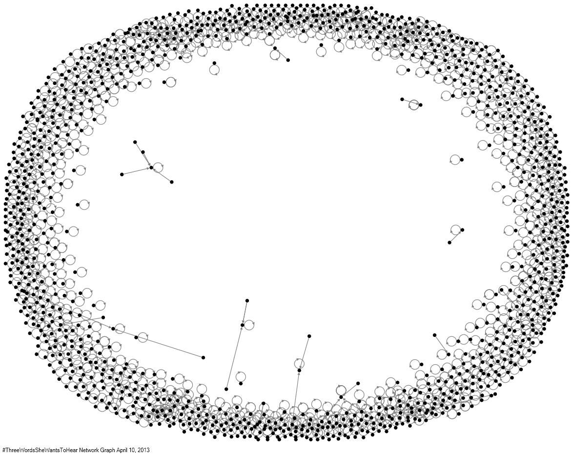
I collected 1426 tweets from April 4 2013 – April 11, 2013 which include the URL bbc.in/12acLLV (a main URL used to link to the GBCS calculator. Some initial results of examining these data are below. Please comment on ideas for better understanding these data.

Top Hashtags in Tweet in Entire Graph Entire Graph Count
whatsyourclass 1061
britain 12
class 11
fb 5
bbc 5
elite 3
rofl 3
poorgeois 3
sociology 2
joke 2
Top Words in Tweet in Entire Graph Entire Graph Count
class 2052
new 1140
whatsyourclass 1062
system 1029
britain 1007
s 1006
group 999
m 983
out 935
found 919
Top Word Pairs in Tweet in Entire Graph Entire Graph Count
class,system 1027
new,class 1015
s,new 999
britain,s 998
group,britain 959
system,whatsyourclass 942
found,out 918
out,m 914
middle,class 426
class,group 408

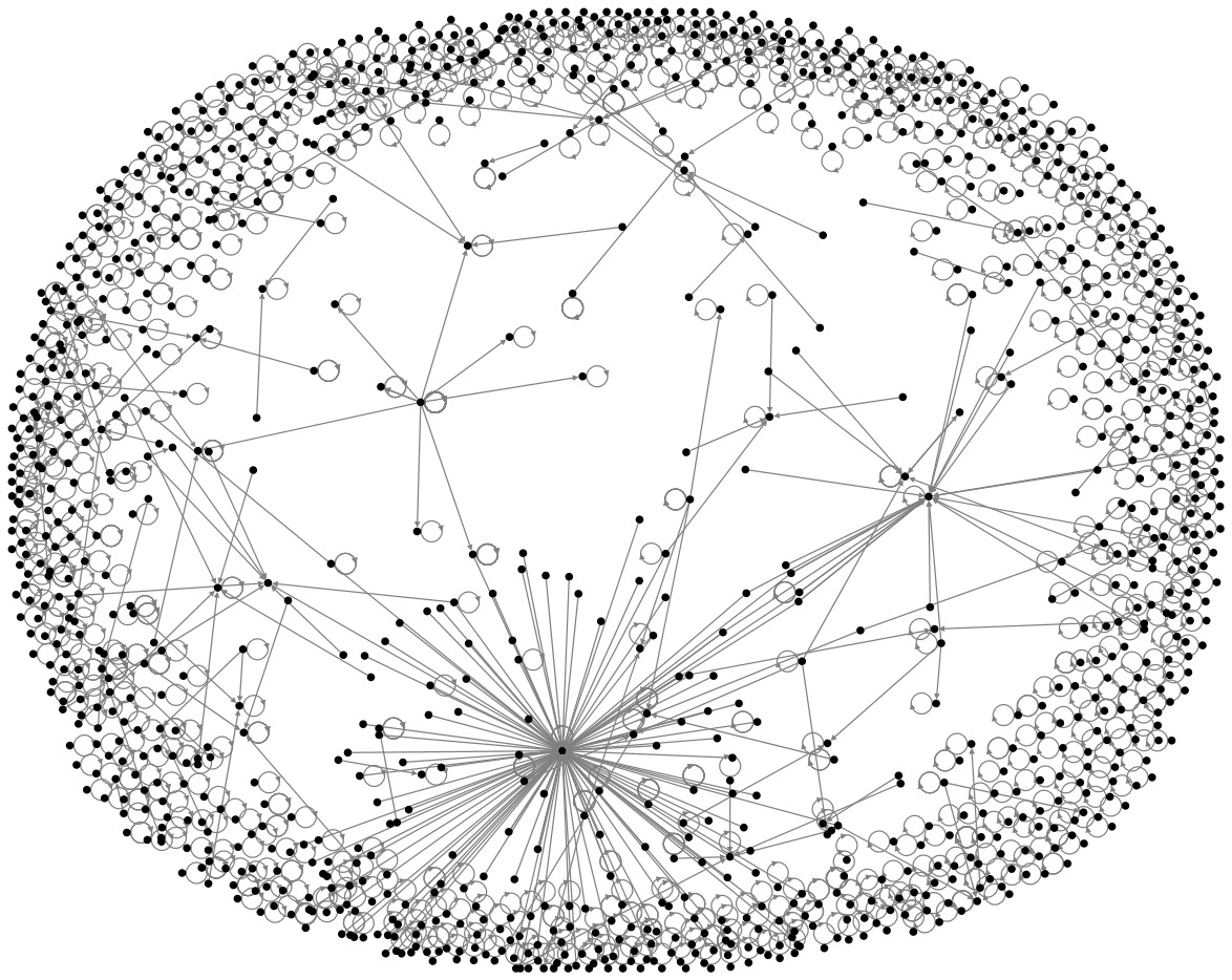
I collected 1204 tweets from April 4 2013 – April 11, 2013 which include the hashtag #whatclassareyou (a key hashtag used to discuss the GBCS). Some initial results of examining these data are below.

Top URLs in Tweet in Entire Graph Entire Graph Count
http://www.bbc.co.uk/news/magazine-22000973 1117
http://www.bbc.co.uk/news/magazine-22025328 7
http://www.bbc.co.uk/news/magazine-21953364 4
http://bbc.in/12acLLV- 2
http://bbc.in/12acLLV…not 1
http://jonathancresswell.co.uk/dailymail/ 1
http://bristolaf.wordpress.com/2013/04/03/the-great-british-class-calculator/ 1
http://bbc.in/12acLLV.nokiddin 1
http://bbc.in/12acLLV.Quessed 1
http://m.bbc.co.uk/news/magazine-22000973 1
Top Hashtags in Tweet in Entire Graph Entire Graph Count
whatsyourclass 1204
britain 12
class 6
bbc 5
fb 4
elite 3
rofl 3
joke 2
sticazzi 2
in 2
Top Words in Tweet in Entire Graph Entire Graph Count
class 1502
whatsyourclass 1203
new 1129
system 1023
britain 1021
s 979
group 968
m 953
out 928
found 899
Top Word Pairs in Tweet in Entire Graph Entire Graph Count
class,system 1021
new,class 1005
s,new 975
britain,s 972
system,whatsyourclass 966
group,britain 939
found,out 898
out,m 892
class,group 399
middle,class 397


In my research of large Twitter data sets, I have been regularly studying trending topics. Most of the time, trending topics encourage monologic behavior on Twitter. For example, see the relatively monologic network graph below of #ThreeWordsSheWantsToHear (a hashtag which warrants serious  critical, dialogic engagement of gender issues).

#ThreeWordsSheWantsToHear Network Graph

I have been investigating the #accidentalracist hashtag from this past Monday (April 8, 2013). The hashtag formed in response to the new Brad Paisley and LL Cool J song titled ‘Accidental Racist’ (video below).

The Huffington Post labeled the song ‘a controversial one, to say the least’ and features the singer donning a Confederate flag. Forbes observed that the song set ‘off a firestorm on social media’.

Given the controversial nature of this hashtag, I was curious whether the tag was encouraging monologic or more dialogic behavior. It turns out that the 1504 tweets I sampled (from 9:56 p.m. to 11:18 p.m. UTC on April 8, 2013) actually exhibited far more interaction than one would expect in a trending topic-based network. Take a look at the social network analysis map below and let me know your thoughts!

#accidentalracist social network map

#accidentalracist social network map


And, as @sociographie, mentioned in a Twitter chat we had, it is important not to solely prioritize relationships in a network graph of trending topics. That is why I have retained isolates. Below, you can also find some aggregate information on the tweets.

Top URLs in Tweet in Entire Graph Entire Graph Count
http://thehairpin.com/2013/04/accidental-racist 28
http://bit.ly/10B2ZPs 21
http://www.theatlantic.com/entertainment/archive/2013/04/brad-paisley-and-ll-cool-j-show-how-not-to-sing-about-the-confederate-flag/274799/ 17
http://ow.ly/jS1zt 10
http://www.youtube.com/watch?v=uC6Ev5o5r7Y 5
http://mashable.com/2013/04/08/brad-paisley-accidental-racist/ 4
http://jezebel.com/brad-paisleys-accidental-racist-song-is-terrible-ho-471297837 3
http://rapgenius.com/Brad-paisley-accidental-racist-lyrics 3
http://www.youtube.com/watch?v=xvgCvT9xX7A 2
http://www.youtube.com/watch?v=a_qbt1EVuw8 2
Top Domains in Tweet in Entire Graph Entire Graph Count
thehairpin.com 28
bit.ly 27
youtube.com 23
theatlantic.com 17
ow.ly 13
youtu.be 10
j.mp 4
mashable.com 4
tinyurl.com 4
jezebel.com 3
Top Hashtags in Tweet in Entire Graph Entire Graph Count
accidentalracist 1493
llcoolj 26
bradpaisley 23
intentionalbeatdown 17
thewalkingdead 7
negrobush 5
occupy 5
ows 5
oppression 5
llcooljoke 4


While I was writing my book about Twitter (Twitter: Social Communication in the Twitter Age), I took an interest in tracking the US Republican primary as it was being constructed within Twitter. Last year, I started collecting all geo-located tweets  (tweets with location information turned on) for the 50 most populous urban American cities (according to U.S. Census statistics ). Because of the geographical richness of this data set, I thought it would be a perfect source to use to study twitter activity surrounding the US Republican primary. Working with  Alexander Gross and Stephanie Bond, I designed and developed a tool to visualize this specific geographically-anchored landscape.

The 2012 US presidential election provided another opportunity to leverage this data. Twitter has been extremely active in terms of election-related discourse. Our Election 2012 Twitter Visualization Tool uses emergent big data research methodologies to visualize the election. The visualization tool has been optimized for the Safari browser (and is known to have some issues in other browsers).

The goal of our research is to explore urban American responses to the 2012 presidential candidates on Twitter. In order to create a representative sample of tweets from urban centers in the United States, we collected tweets from Twitter by location. We took the 50 most populous American cities according to the U.S. Census and instructed Twitter to send us tweets that were within 7-12km of the locations of these cities.

Our software collects these geo-located tweets and uses the data to chart the relative buzz surrounding candidates in the 2012 presidential election. The tool charts the relative popularity of each primary candidate as measured by the number of tweets which we have collected over the last 24 hours and identified with a particular candidate. For a tweet to be counted as referring to a particular candidate, the tweet must contain the candidate’s first and last name separated by a space e.g. “Mitt Romney” or the candidate’s official campaign twitter account name or the account name eg @mittromney. A single mention as reported by the chart’s dynamic legend is equivalent to one tweet which contains one of the candidate names. Tweets which contain more than one candidate name will be counted as mentions for both candidates. These stringent rules prevent unecessary possible over counting of tweets for a candidate. Though the frequency of the tweet count in our visualization is low because of this, the data collected is very robust. Specifically, all tweets visualized do refer to Obama or Romney.

Please visit the tool’s webpage at my lab, the Social Network Innovation Lab, for more detailed information.